What color should you use in your next trade show display?
 If you’ve ever painted your home or office, you know what a daunting task picking the right color(s) can be. Frankly, it’s not an easy chore with the endless color possibilities to pick from and worse, keeping in mind what your customers will think or more importantly, feel, when they see your color selection.
Color helps elicit emotional responses and is used strategically by brands all around the world in their logo, website, marketing materials, product labels, trade show displays… you get the idea.
It’s the emotional connection from its customers that brands strive for, and is why color is so important to a brand, and equally important in your next >trade show display design. So before you start talking creative for your next tradeshow booths, and begin searching for trade show exhibit companies consider the following as to what you want to achieve with your new trade show booth display at the show and the tips to ensure your color choices are effective.
Grab Attendee’s Attention
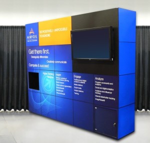 Exhibitors generally have 4-6 seconds to grab a passing attendee’s attention. Your display design helps to do that, and also sets you a part from your competition. Think bright, vivid colors and eye-catching murals over heavy text.
Your Brand, Loud and Clear
Great! You’ve peaked their interest with your attention-grabbing hues, but can you keep them in your booth? Don’t think that colors are the only thing to worry over when designing your trade show display. You need to clearly communicate your brand to prospects. Don’t add so much color and a hodgepodge of elements to your design that prospects can’t –
A. Identify quickly who your company is
B. Identify quickly what your company does/sells
Sometimes that messaging takes a back seat to design, when it should be prominent. Another thing to note, don’t disregard your company colors and branding to design your display as nothing more than a vivid (and confusing, meaningless) rainbow. Make sense with your color scheme, and always be true to your brand!
Combine the Two in Perfect Harmony
Here’s where grabbing your prospect’s attention and staying true to your brand come together in perfect harmony. Consider sticking with your core colors, and adding accent colors. Tip: bright colors are often used as accent colors because too much of them and they’re hard on the eyes.
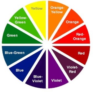
Besides using accent colors, consider using complimentary colors. Complimentary colors are ones that point exactly across from one another on the color wheel, and are another good option. Like orange and blue, yellow and purple, red and green. Another point to make is it’s a misconception to leave majority of your trade show booth display white. Yes, white gives it a clean, simple look – but honestly you will achieve more by adding an eye-catching mural or graphic and eliminating the white space.
Don’t forget the color of your text, especially if text has to go over color. Make sure you to play with background and text colors to find out if it’s a poor, good, or great combination.
According to color/emotion properties, here’s what our colors at GraphiColor Exhibits should make you feel:
- Red: excitement
- Purple: contemporary
- Blue: trustworthy
- You have 4-6 seconds to grab a passerby’s attention, do so with color and stand out.
- Let your brand shine through, loud and clear, and stick to colors that help to identify your brand.
- Trade show booth display design is successful when color is used effectively to grab attention and communicate your branding in a clear, cohesive manner.
To Recap:
GraphiColor is a trade show display company who specializes in: