Effective Exhibit Design For the Win

Why is effective exhibit design so important, anyway? You only have 3-5 seconds to grab the attention of attendees as they cruise the trade show floor. This is not a big window of time! Your trade show display must demand attention, communicate your company’s message, showcase your products or services and entice the audience to come in and ask about more. For all of these reasons and more – exhibit design is a crucial element to success at a trade show.
There’s a lot of opportunity in your trade show planning stages to design a kick-butt exhibit. There could even be so many ideas or thoughts that you might not know where to start. We’ll simplify things a bit, if we can, and provide our top five tips for effective exhibit design. Here they are:
#1 – First, Grab Attention
Nothing happens until people visit your display booth. The challenge is that short window of time (remember, 3 to 5 seconds!) to grab their attention as they’re walking by. Your trade show display graphics must make an immediate impact to those who pass by your booth. Using movement (such as a video wall or monitor) as well as lighting – can help you stand out from the crowd.
#2 – Limit The Message
Less is more when it comes to presenting your trade show marketing message. Limit your message to its most powerful elements. Rather than communicating a dozen features, focus upon three or four key benefits. By listing those which speak directly to your audience’s needs, your trade show exhibits will make an immediate impact. We also suggest keeping important text above the waistline (or at eye level as often as possible) on your display graphics. If people are standing in front of your display, think about what messaging they could be blocking.
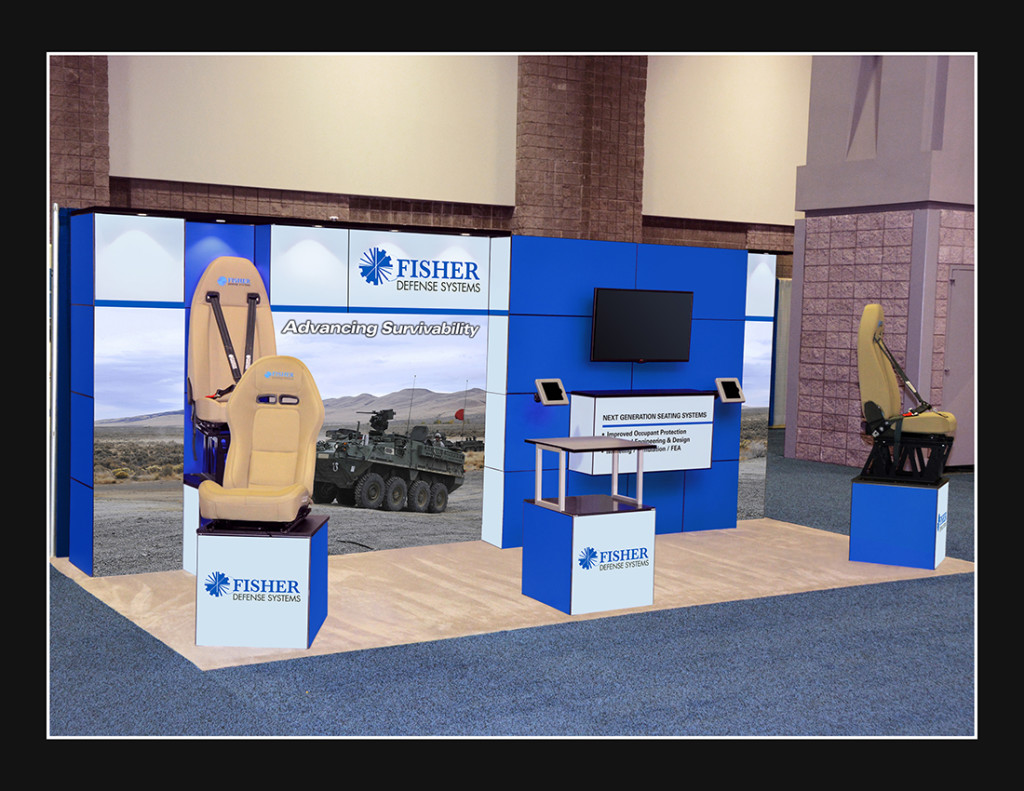
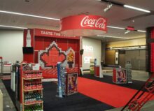
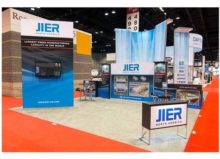
Great example of one of our clients who embraced a nice open-spaced design with clear branding and messaging.
#3 – Have an in-booth plan
Effective exhibit design means more than just making sure your graphics look good. Know what the flow will be inside your booth, what you will be doing with booth visitors and what can you do to keep them engaged. If possible, include demonstrations within your trade show exhibits that allow your visitors to actively participate. Most people will walk by a crowded booth space so make sure yours is open and welcoming.
#4 – Clear The Path
Here’s a secret: You know that clunky, 8-ft table that is often placed in your booth by show management? Get rid of it! Clear the way for trade show attendees to enter your display area. Don’t put up a barrier between the aisle and your sales people working the booth. If you have to use a table within your space, keep literature and marketing collateral organized and tidy, and NO sitting behind the table.
#5 – Have a consistent image
Your trade show display should represent a visual extension of your company’s brand. By communicating the same powerful message or image in your display booth graphics, staff apparel, marketing collateral, and promotional giveaways, you maintain consistency. Over time, that consistency creates familiarity in your audience, bridging the gap between you and your prospects more quickly. In a nutshell, branding is your good friend.
Attracting your target audience and encouraging them to visit your exhibit over your competitor’s doesn’t happen by accident. Getting the traffic you desire at a trade show requires careful planning and execution of proven strategies, including using a professional and well-thought out design. For more tips on exhibit design, check out our entire blog collection, or give us a call. We’re always happy to assist you in bringing your next great display to life.
What are some of your exhibit design challenges? Leave your design woes in the comments, or Tweet them to us!
Photo Credit: DPK Graphics; Echo Enduring Blog
NEXT STEPS:
1. Check out more handy successful exhibiting blogs, effective exhibit design tips and more in our blog.
2. Check out our Resource Center for exhibiting-packed tips and downloads!

