Your Trade Show… Billboard?
It might sound weird, but you should design your trade show booth display like you would a billboard and not like a brochure. Whether you’re exhibiting in a 10×10 booth space with a pop-up display, or a 30×30 with an elaborate MultiQuad display system, your display is your own personal Van Gogh. Your trade show booth display is the canvas that houses your branding, marketing message, call to action, and stunning visual. A lot of designers put a lot of stock into the graphics, and for good reason since you only have 3-5 seconds to catch a passing attendees’ attention. A stunning visual is one way to have attendees pausing to stare. In fact, there are a few things you can do to help draw attendees into your booth and we listed them out for you in one of our last blogs: Effective Exhibit Design for the Win.
Here, we’re just going to focus on stripping the graphics from your beautiful display and evaluating what’s left. So, what if you removed your visual? Would your marketing message and branding stand on its own, or fall flat? An effective trade show booth display has a clear and compelling marketing message and consistent branding. Does yours?
Picture your display in black and white. You’re hurrying down the aisle of a busy trade show, and you glance to your display in passing.
- Is the text easy to read quickly?
- Is your marketing message simple and memorable?
- Is your logo and website placed high enough to be seen over a crowd?
- Is your branding consistent?
These are all things you should be taking into effect when designing your trade show display design, and the answer should always be “yes”. When it comes to your marketing message, less is more, like on a billboard. Believe it or not, I still read billboards when I’m in the car driving by… and some of them I can never read in time before I pass them because they are so text-heavy and they have no clear marketing message. Don’t let that be your display.
While color and visuals are important to the overall look, feel and effectiveness of your design, your text is every bit as important. So think about a billboard, what would you say on it?
Example:
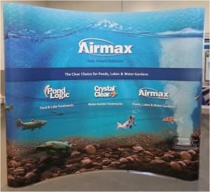
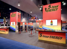
Our Airmax display has a stunning graphic, but what about the marketing message and branding on its own?
If your display was in black and white, would your marketing message and branding be able to stand on its own like Airmax?
NEXT STEPS:
1. Take a look at our related blog post: Effective Exhibit Design for the Win
2. Here’s another blog post: What color should you use in your next trade show display?

